Paragon Super app — UX Case Study
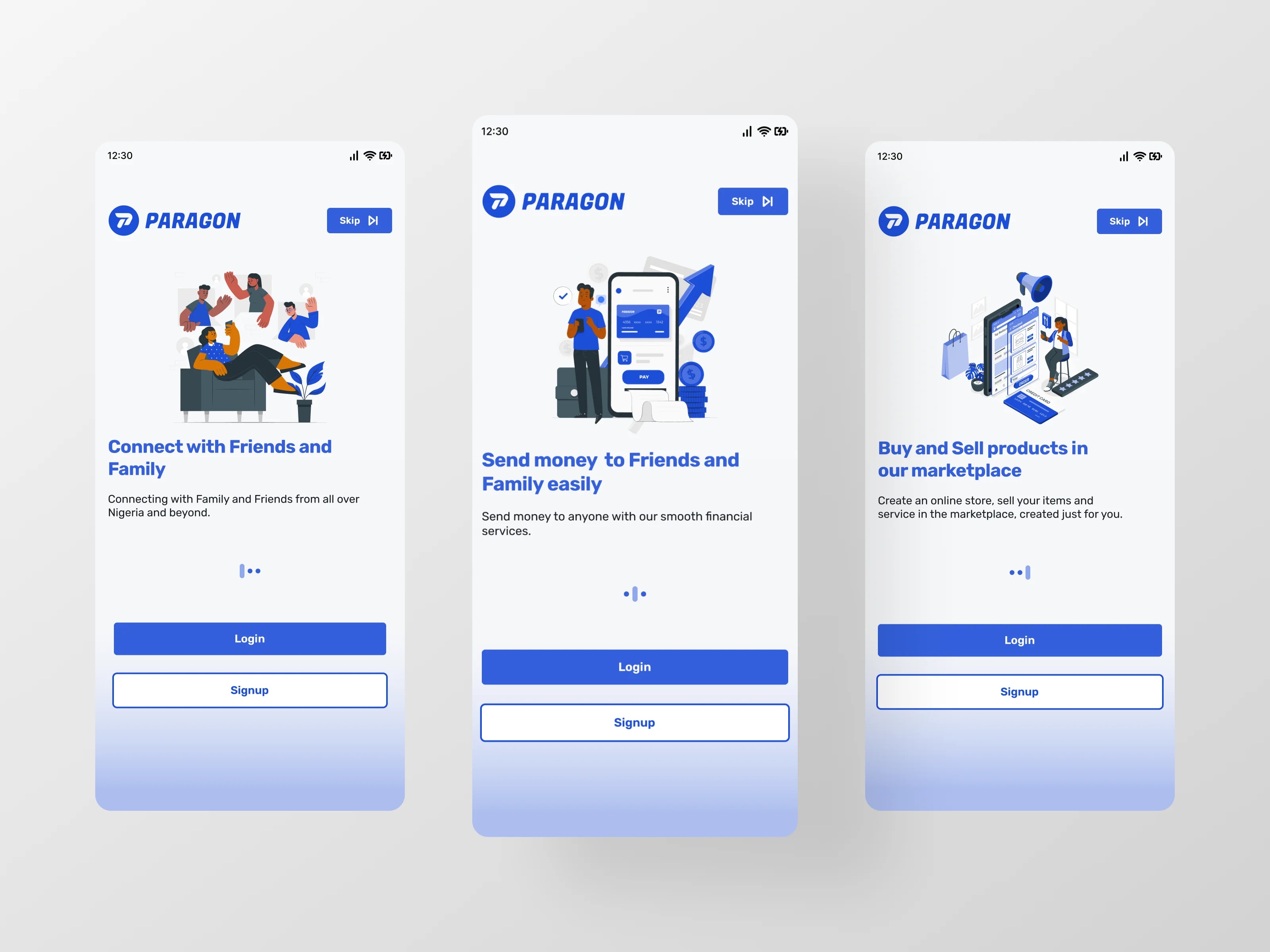
A super app concept unifying money, messaging, food ordering, and marketplace in one experience
- Client
- Self-initiated concept
- Year
- 2026
- Industry
- Fintech / Super App
- Location
- —
The problem · 1/5
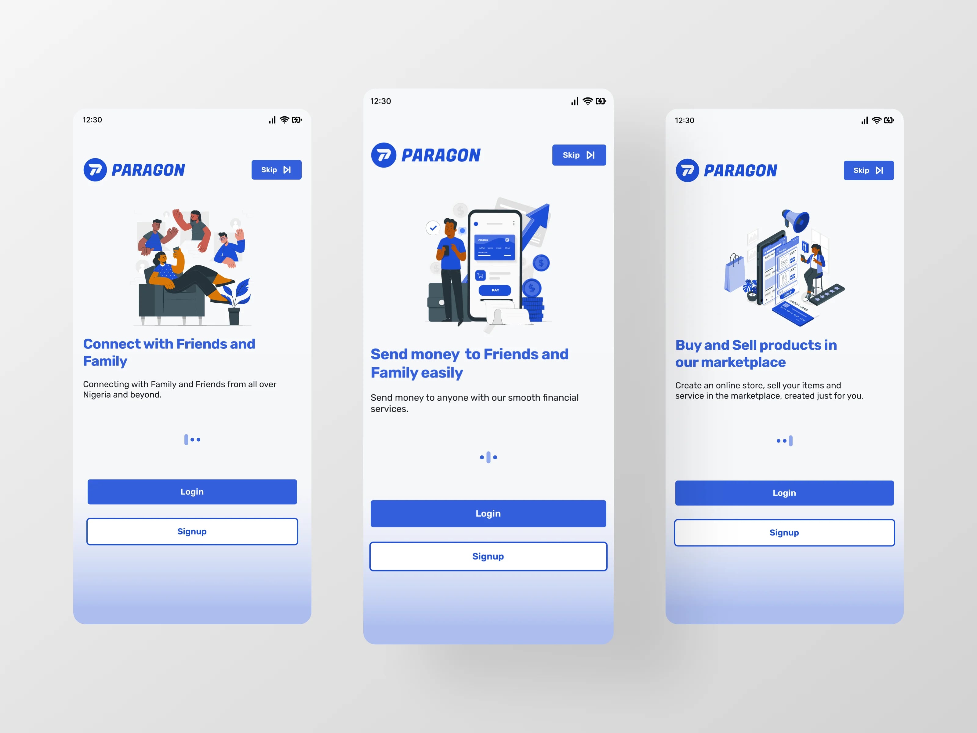
People were managing their digital lives across a pile of disconnected apps — one for money, one for messaging, one for food, another for shopping. Every switch meant a new account, a new interface, and a new place where things could go wrong.
The research confirmed it. The 25-person survey showed heavy fintech use — 60% daily, 20% weekly — with sending money the top task (76%), followed by saving (44%), paying bills (16%), budgeting (8%), and shopping online (4%). The most-used apps were Moniepoint (56%), Piggyvest (52%), OPay (32%), PalmPay (20%), and Kuda (12%). And 88% of respondents wanted a single app combining banking, saving, spending, and sending.
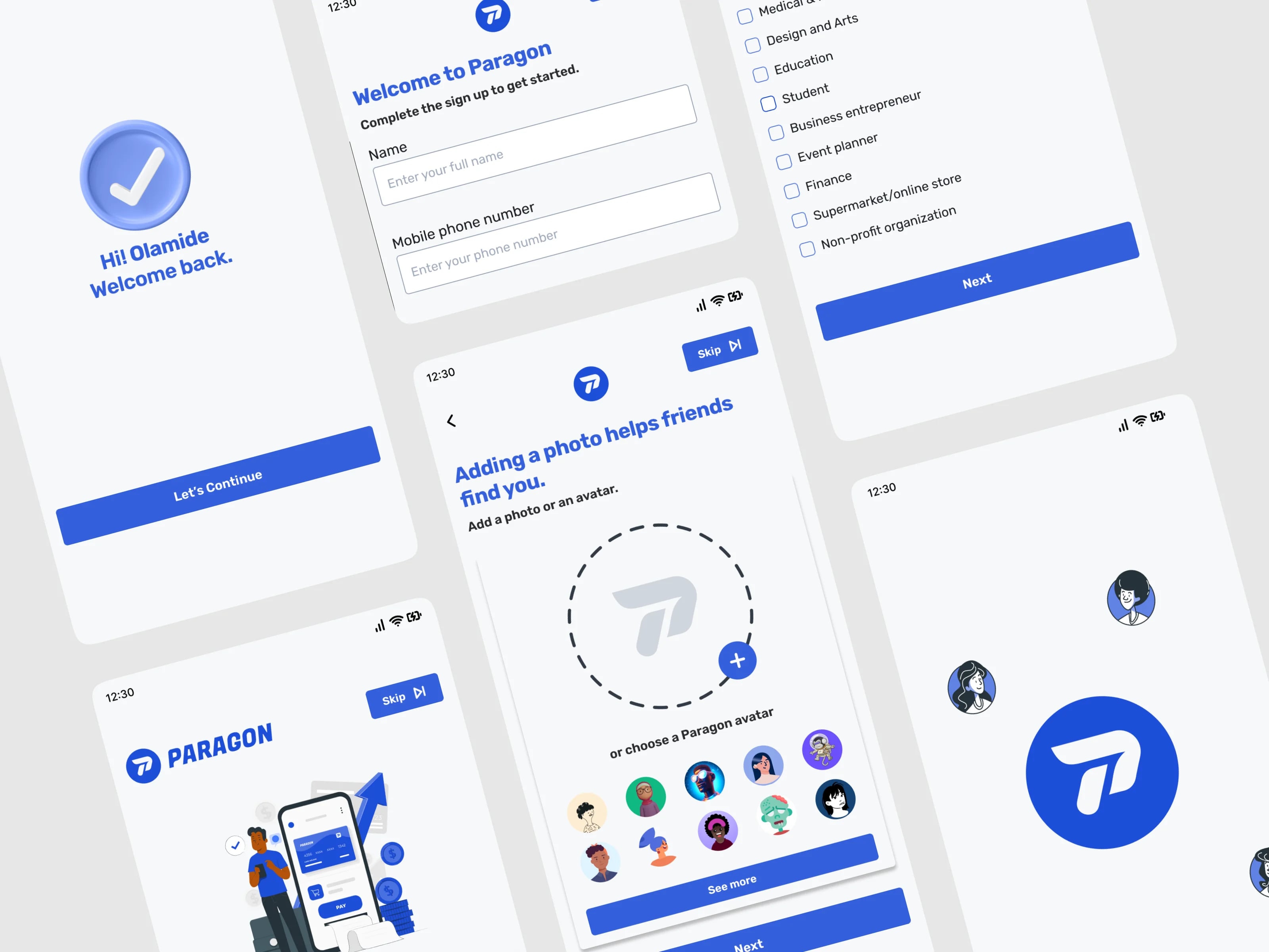
The competitive review showed why: OPay was strong on transfers but crashed during transactions and had poor support; PalmPay offered cashback but had a poor interface and poor onboarding; Piggyvest was engaging for saving but weak on transfers with low interest; Kuda had failed transfers and no real customer support; Moniepoint was strong for business but had a complex onboarding and poor interface. The journey map showed the same pain at every stage — slow, complex sign-up and verification; unclear features and confusing navigation; failed transfers; savings plans that were hard to follow; and slow support when things went wrong.
The design problem was therefore bigger than one app category: build a single super app that is clear to navigate, reliable to transact on, and easy to get help with — across money, messaging, food, and shopping.
Key features · 2/5
All-in-one money
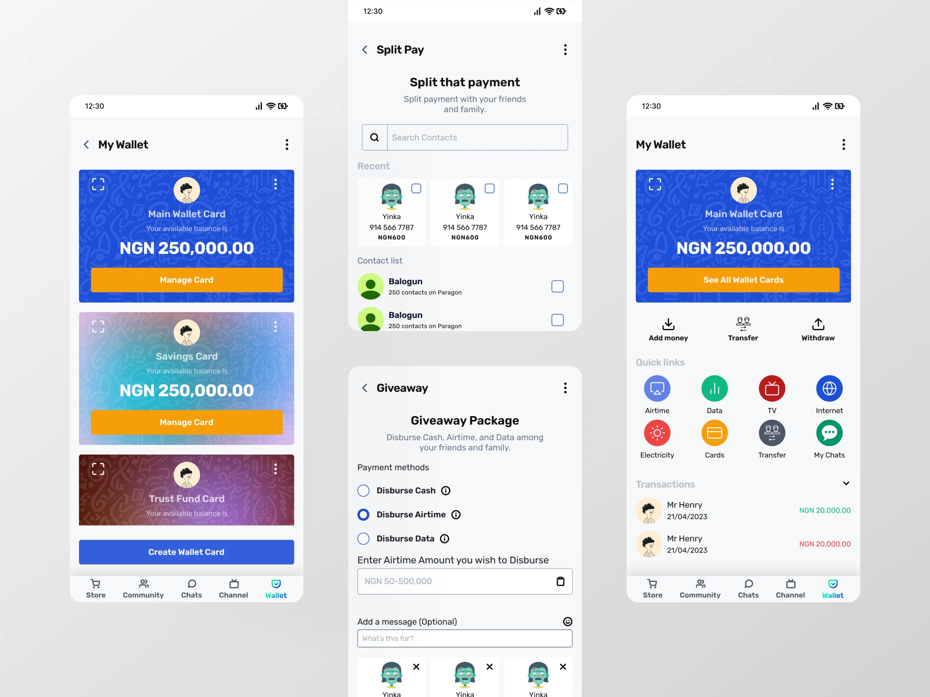
Save, spend, send, and pay bills from one wallet instead of several apps.
Savings goals
Set targets and track progress toward each goal.
Fast transfers
Send money in a short flow: recipient → amount → reason → confirmation → success.
Key features (cont.) · 3/5
Chats & Circles
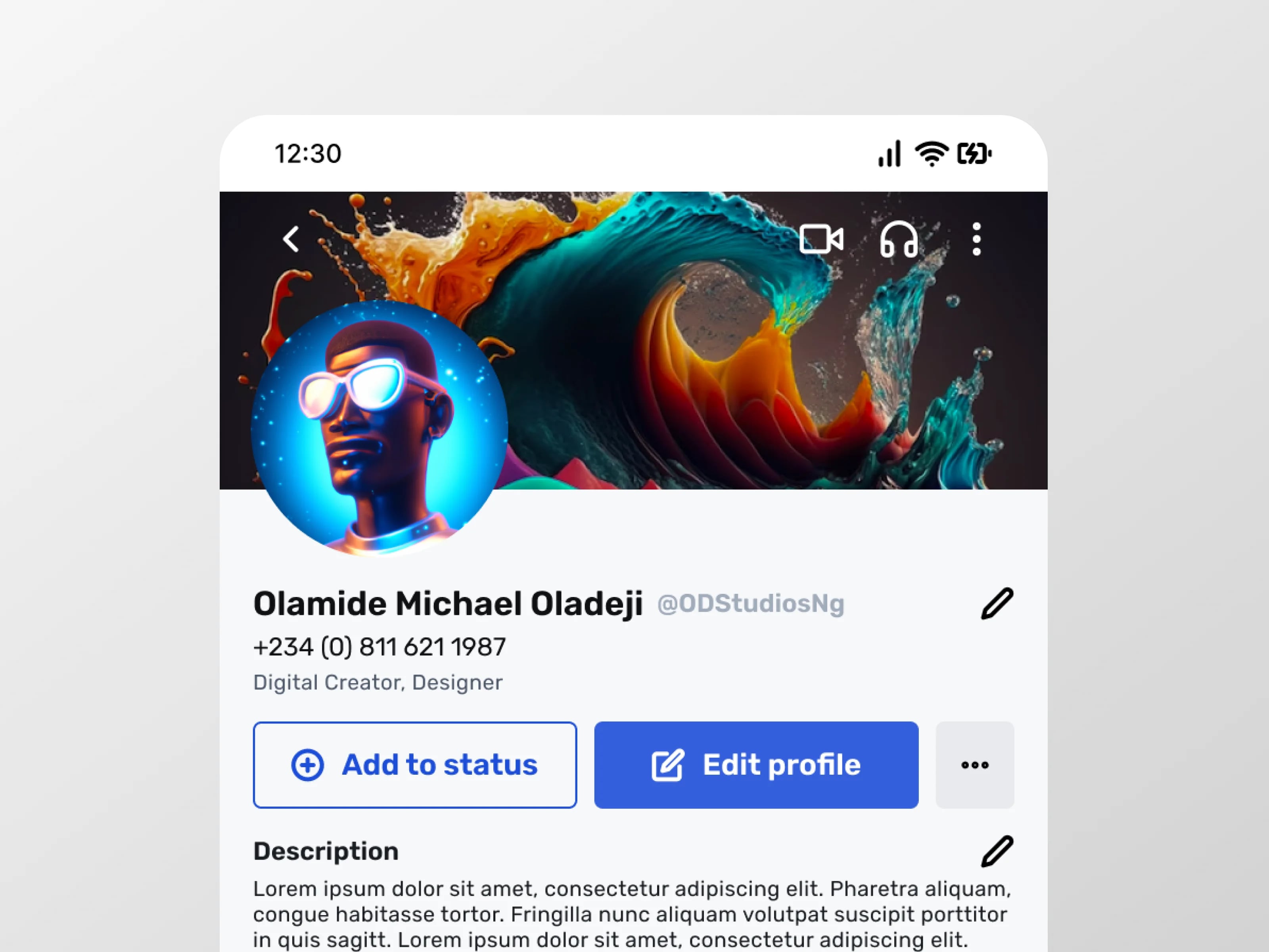
Message friends with text, voice, and video; gather in circles for groups.
Channels & Community
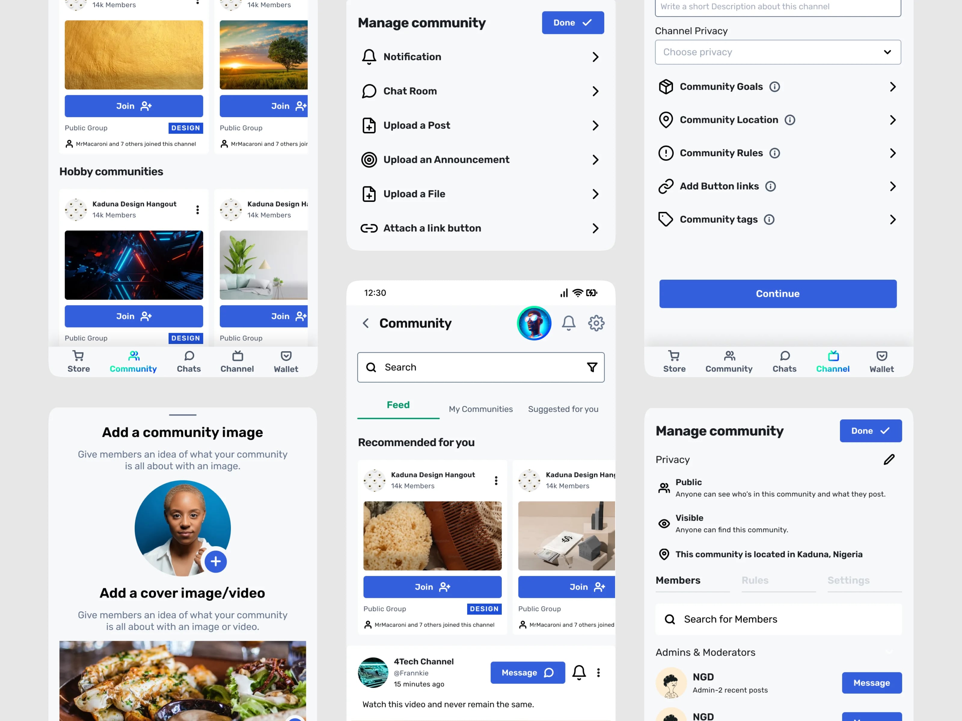
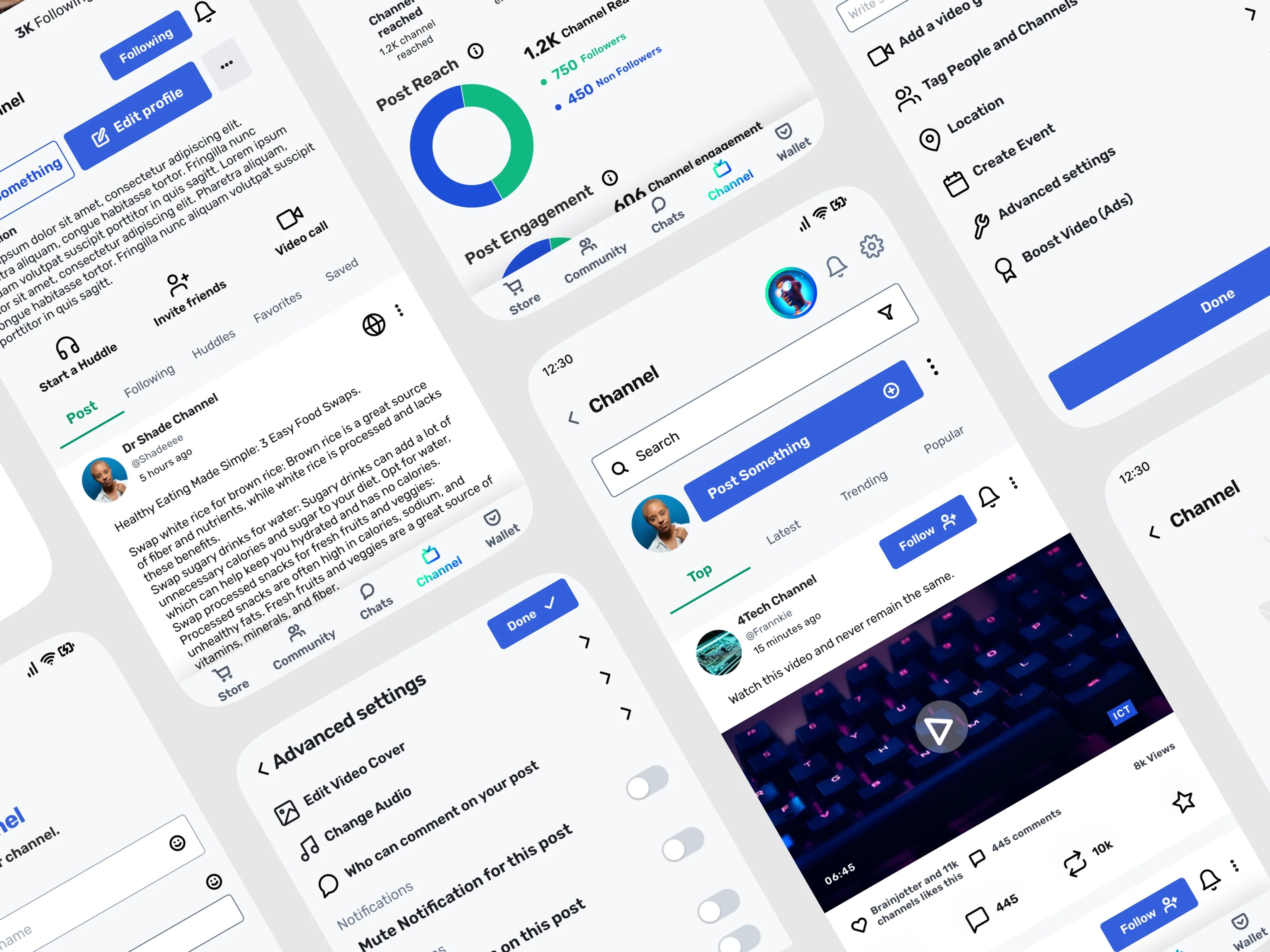
Follow channels, create posts, and join community spaces.
Marketplace
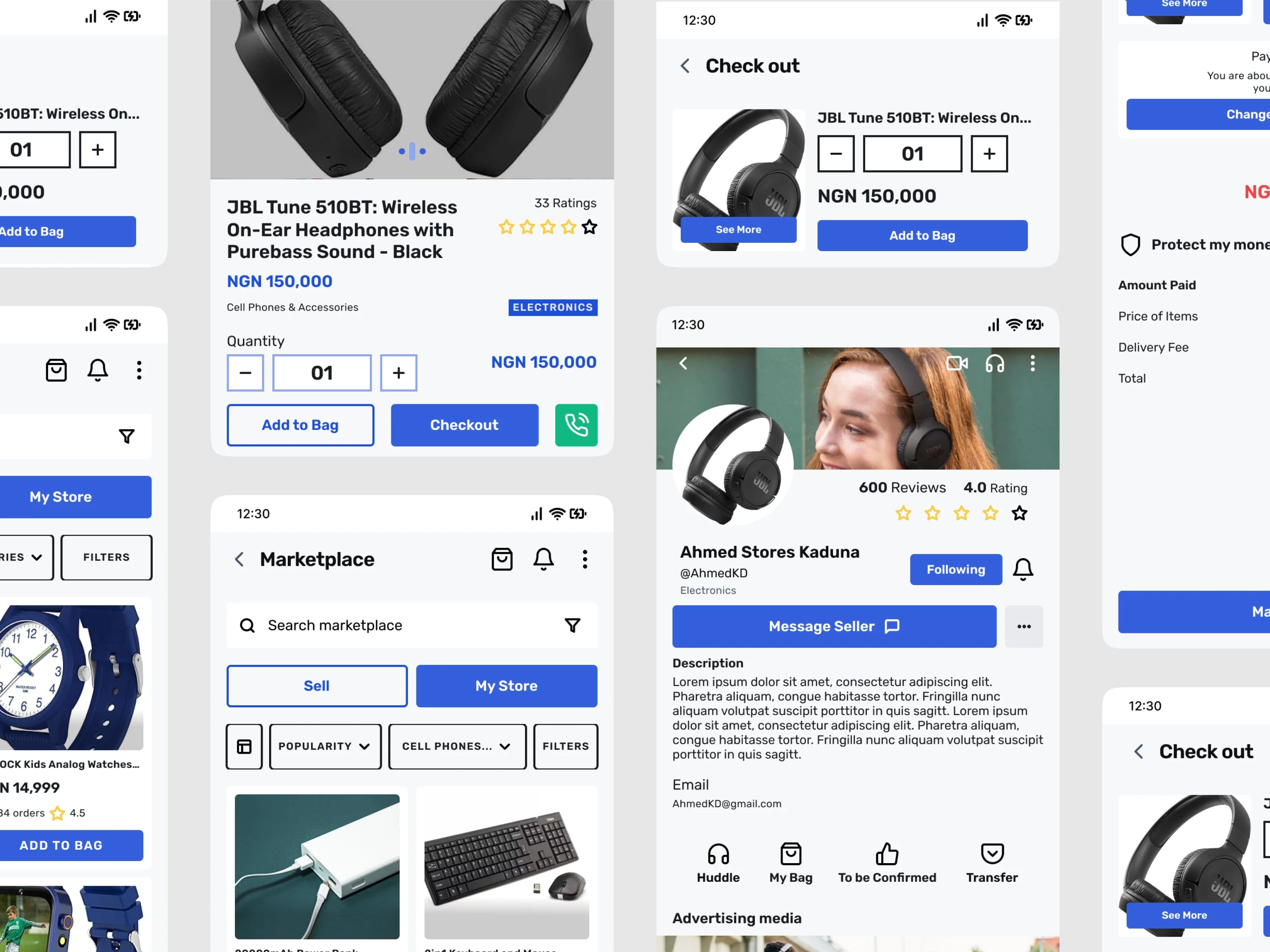
Browse stores and sellers and buy without leaving the app.
Key features (cont.) · 4/5
Food ordering
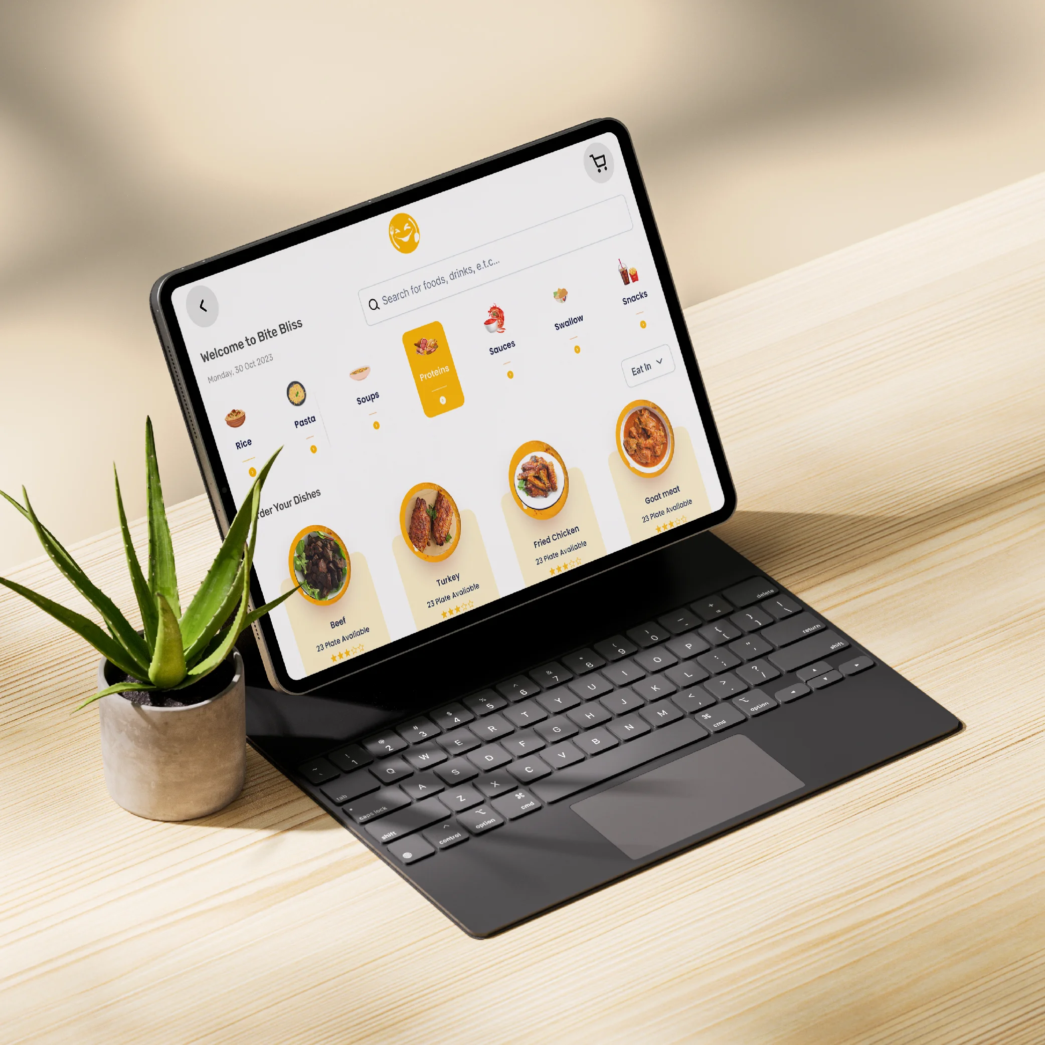
Search restaurants, build a cart, check out, and confirm the order in-app.
Spending insights & history
A category breakdown of spending plus a full transaction history.
The result · 5/5
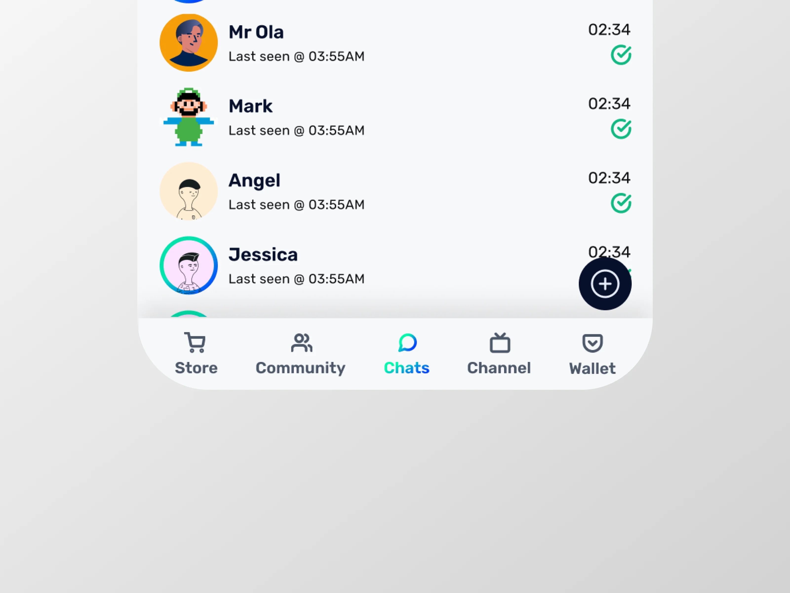
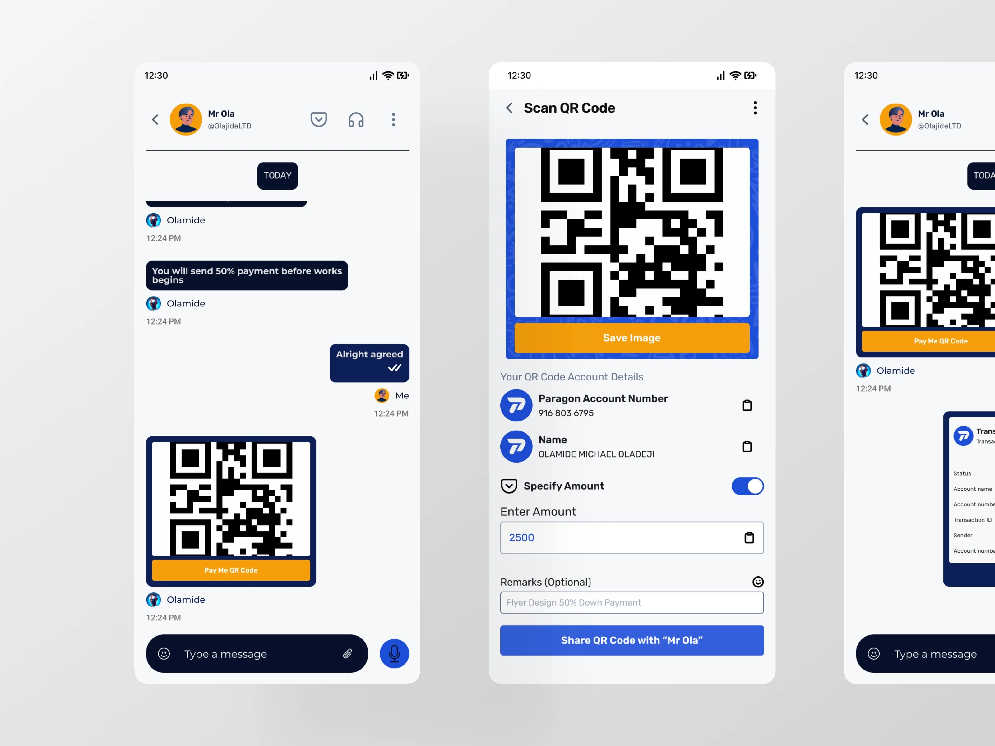
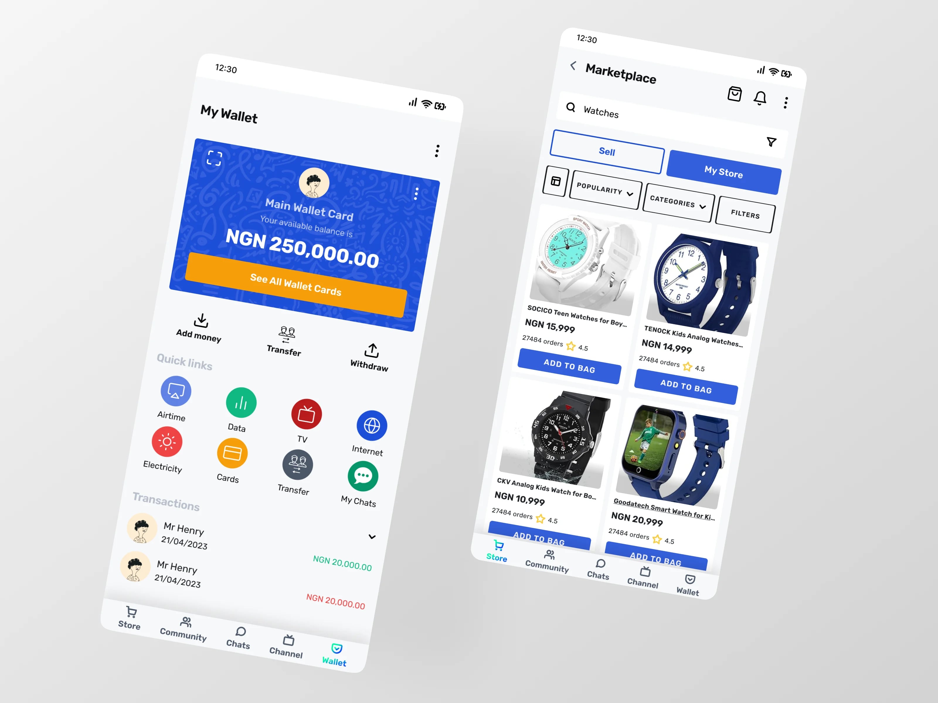
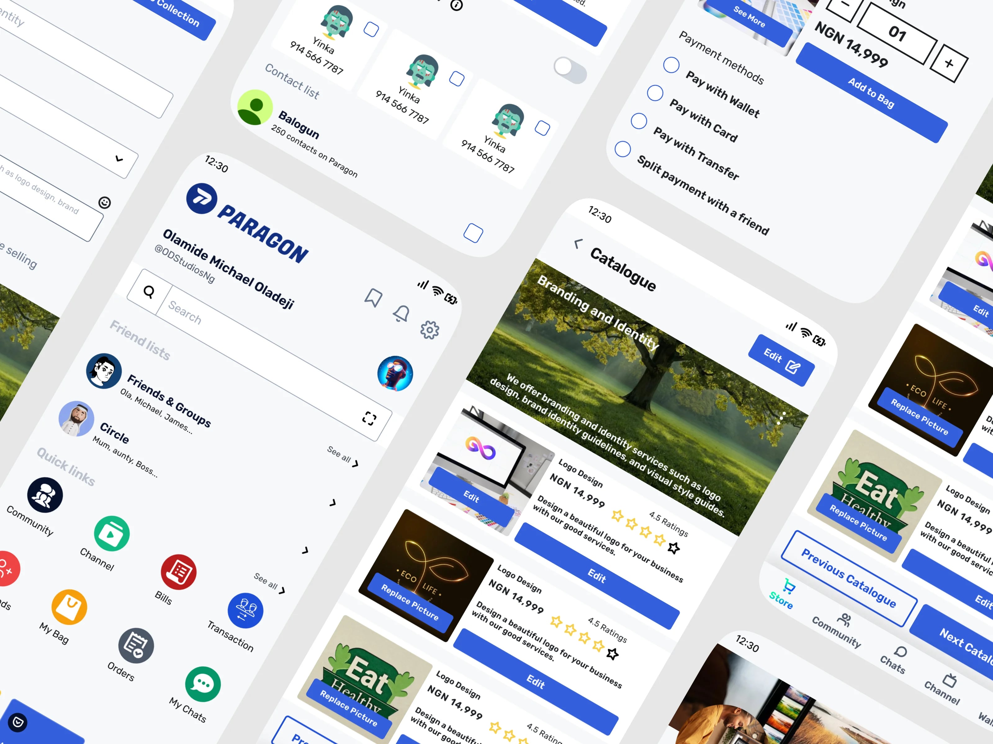
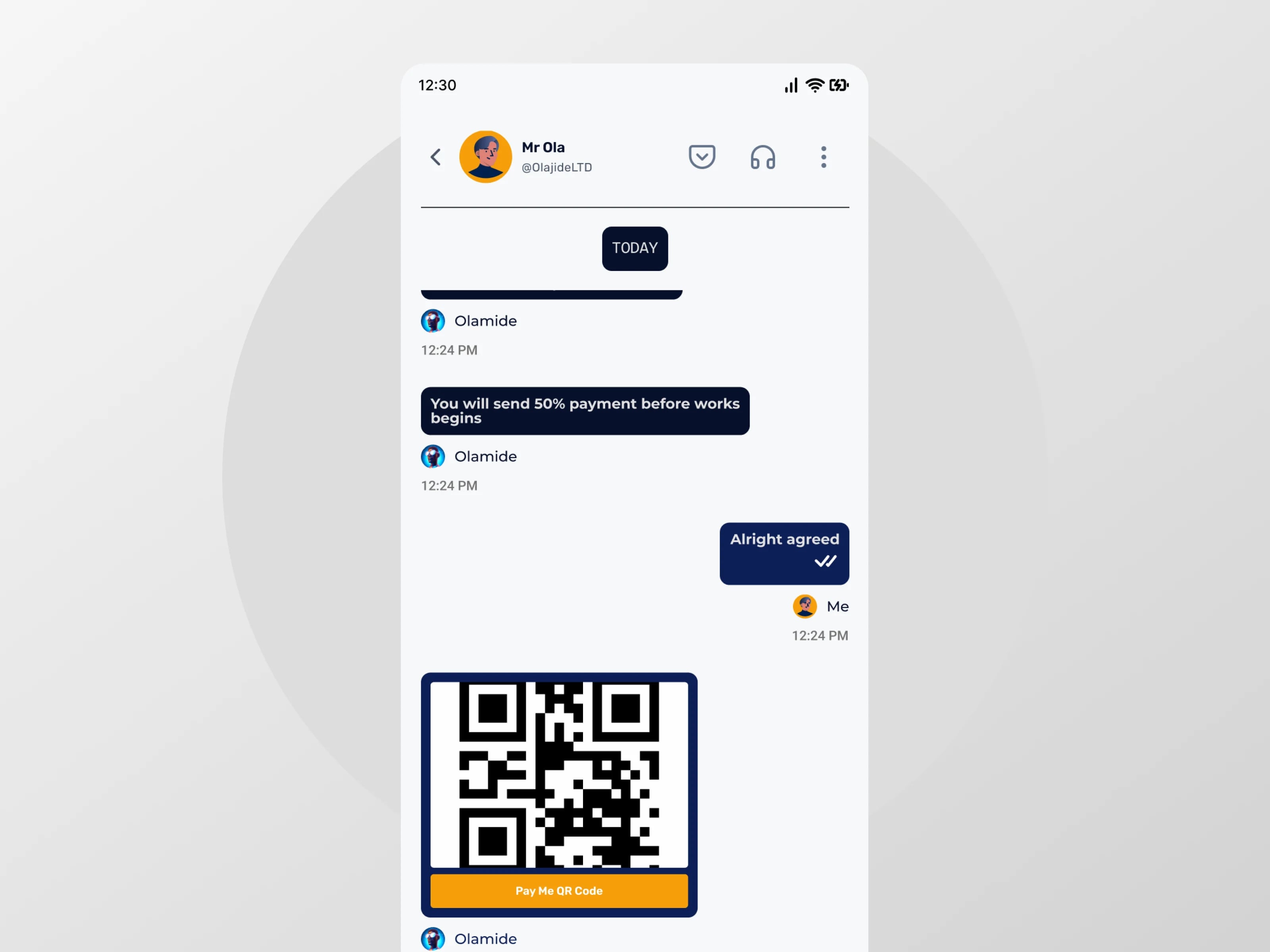
The final design gives every part of the super app a clear home. The dashboard shows balance, income, and spending with quick actions. The wallet holds savings goals with visible progress — Emergency Fund, Holiday in Lagos, New Car, New Phone — plus a send-money flow (recipient → amount → reason → confirmation → success) and a scannable transaction history. Chats support text, voice, and video; circles and channels give groups and communities their own spaces. The marketplace lets users browse stores and sellers, and the food flow runs end to end: search, store page, cart, checkout with a Protect My Money toggle, and order confirmation.
In Maze usability testing with 25 participants across 2 tasks, the prototype recorded 96% task completion, 92% satisfaction, and a 4.6 out of 5 average rating. Tester feedback drove a round of iteration: the transfer button was made easier to reach, transfer iconography was clarified, product descriptions were added, search was added for stores, and a product-reviews feature was added.
Next steps in the case study: continue user research, test with a broader range of users, and expand into budgeting tools, expense tracking, and investment options — plus exploring partnerships with financial institutions and businesses.
Video
Figma
Gallery
Related work